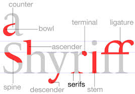
serif
n. 衬线
n.
衬线,截线(衬线指的是字体起始末端的细节装饰);衬线体;
英英释义
serif[ 'serif ]
n.a short line at the end of the main strokes of a character
同义词:seriph
双语例句
用作名词(n.)
For example, should it be a serif or a sans serif?
比如说,它应该是一个衬线字体还是一个无衬线字体呢?
If your fancy font looks old fashioned, then use a serif font as your secondary font.
如果你的艺术字看起来很正规化,那就用衬线字体作为第二字体吧。
权威例句
A shallow fault‐zone structure illuminated by trapped waves in the Karadere–Duzce branch of the North Anatolian Fault, wester...Senescence and immortality in hepatocellular carcinoma.
Prevalence of hepatitis B infection in the southeastern region of Turkey: comparison of risk factors for HBV infection in rural and ...
Percutaneous transthoracic CT guided biopsies of lung lesions; fine needle aspiration biopsy versus core biopsy
An epimerase-reductase in L-fucose synthesis
A site of action of phenethylbiguanide, a hypoglycemic compound
Potential effects of zinc on information processing in boys with attention deficit hyperactivity disorder
The effect of 6-deoxy-6-fluoroglucose on glucose utilization in kidney tissues
Tissue distribution of C14-labeled beta-phenethylbiguanide.
Religion and Social Change in Modern Turkey
serif (n.)
in typography, 1841, earlier ceref (1827); see sans-serif.
1. Grotesque: Group of typefaces calssified under the British Standard.A form of the sans serif typeface.
哥耶斯格体:依英制标准分类的一组字体。是无衬线字体的一种形式。
-- 来源 -- 英汉 - 翻译参考[网络]
2. Sans serif
无视线字体
-- 来源 -- 英汉 - 翻译样例 - 行业
3. printed in a serif type-face
用字母带衬线的字体印刷.
-- 来源 -- 汉英 - 翻译参考
4. Egyptian: Type style recognizable by its heavy, square serif.
埃及体:一种字体款式。它有着方形衬线,容易辨认。
-- 来源 -- 英汉 - 翻译参考[网络]
5. Square serif
方形衬线
-- 来源 -- 英汉 - 翻译样例 - 行业
6. Sans serif: A typeface without serifs and constructed from strokes of nearly uniform thickness.
无视线字体:并无视线的字体,它的书刊由差不多同一粗细的线条组成。
-- 来源 -- 英汉 - 翻译参考[网络]
7. For ease of identification. English typefaces can be divided into three main groups, viz: "types with serif", "types without serif (sans serif)" and "decorative".
亦有一些字体,其中只有轻微差别。方便辩认,字体可分为三大类,即是:‘有衬线’,‘无衬线’和‘装饰体’。
-- 来源 -- 英汉 - 翻译参考[网络]
8. I learned about serif and san serif typefaces, about varying the amount of space between different letter combinations, about what makes great typography great.
我学习写带短截线和不带短截线的印刷字体,根据不同字母组合调整其间距,以及怎样把版式调整得好上加好。
-- 来源 -- andy340216.55w.net
9. I learned about serif and sans-serif typefaces, about varying the amount of space between different letter combinations, about what makes great typography great.
在这个班上,我学习了各种衬线和无衬线字体,如何改变不同字体组合之间的字间距,以及如何做出漂亮的版式。
-- 来源 -- www.lzoutdoor.com
10. Gothic: Early gothics are better known as Black letters.Contemporary gothics are plain,sans serif type-face with lines of unvarying thickness.
哥德体:早期的哥德体亦称“古黑体”。现代的哥德体是等粗线条、无衬线的字体。
-- 来源 -- 英汉 - 翻译参考[网络]